Kategorier
Cases

Sensum

Making the perfect outdoor furniture is an Art. With refined outdoor furniture from Sensum you have the scope for shaping a perfect outdoor living space – a place to play, relax and socialize. A place to create some of life’s most valuable moments. 
The sleek Scandinavian designs mean we compromise neither form nor function. Created with skillful craftmanship and a keen knowledge of materials, the collection of outdoor furniture is as exquisite as it is comfortable. 

Because of its high quality, timeless form and sturdy build, our furniture only becomes more elegant as the years go by. That is true sustainability. 

Sensum are proud to prolong the Scandinavian summer.      
J.design has had a full ownership of the case including all from naming, strategy, identity, packaging, brochures, shop-in-shop etc. 

Kategorier
Cases

Åre Water

Åre Water are proud to be able to offer you a supremium natural mineral water. The Åre Source, found in the North of Sweden, is one of eleven certified natural mineral water sources in Sweden. Åre Water has been given a seal of approval labelled ”Superior” (i.e. very low content of nitrates), which indicates the purity of the water, untouched by man. Åre’s clean and pristine mountain landscape offer a good environment for the water where layers of rock and sand, which have been created by the ice age, allows for good filtration of the water and is therefore protected from external influences. 

The products are sold primarily to retailers, restaurants and hotels in the premium segment and is currently sold in Sweden, France, Monaco and Singapore.


J.design has been responsible for the graphic concept, branding strategy, packaging design, web etc. 

Kategorier
Cases

Cocktailgruppen

Cocktailgruppen is a Swedish event agency that works with bar catering, hiring bartenders, catering and events.

They develop bar concepts, work with advice and planning, train staff and have courses. Everything from small workshops to large corporate parties. The cocktail group has conducted over 1500 events, despite starting in 2019.


J.design has helped out with logo and graphic profile.

Kategorier
Cases

Carpe Diem Beds

Inspiration can often come from the most unlikely places – like a heather bed on a Swedish rocky island. But it is precisely from there that the original idea for the Carpe Diem Beds comes when aspiring chiropractor Börje Thuleskär fell asleep by the sea and dreamed of a bed with the same flexibility, softness, and support as a heather bed. 


Today, Carpe Diem Beds stands for design, quality, and innovation. Their goal is to create the world’s most beautiful and innovative beds, inspired by Sweden’s west coast. Always hand-built, always the best materials.

J.design has helped Carpe Diem Beds with the design of beds, accessories, brand book, etc.

Kategorier
Cases

Pure:est

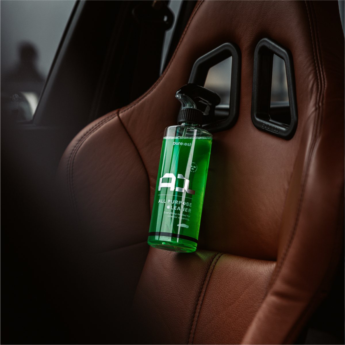
Pure:est is the new Swedish high-tech car care brand that offers the very latest and most effective products for care and maintenance of car paint, trucks, motorcycles and such. The products are 100% manufactured and developed in Sweden, and the formulas have been developed over 3 years. The brand launched in 2019 and the product line includes all related to car washing such as shampoo, wheel cleaner, interior cleaner, paint protection, tar remover, accessories etc. 

The company has already established a solid customer group and is now working on an international establishment, primarily in EU and United States.

They came to J.design during end of 2020 and was in need of a full rebranding to match the quality of the products, as well as the high ambitions with the brand. 


A full new Strategy and rebranding with a new logo & symbol, corporate identity and packaging concept was made during end 2020 – beginning 2021. 

The vision was to create a modern identity that stands out in the otherwise pretty dull industry. Adding attraction to the products was important. But also to have a clean and dynamic identity that communicate and builds further on the name Pure:est, basically meaning as clean as possible. Pure to heart, hazzle-free products, pure in the communication.

A symbol visualising the letter P for Pure:est but also the spray cap used on the products became the foundation of the CI, but also a unique font, an animated graphical pattern (of water) and more builds and sets the tone in the communication.

Now the new Identity has been launched with great interest, and has already been accepted by mayor retail dealers. 

pureest.com

Kategorier
Cases

Hatt et Söner

HATT et SÖNER is the only Swedish owned Champagne house in the world. Founded in 2012 but with a history in champagne that goes over 4 decades back. They seek to preserve the purest possible expression of nature and embracing manual labor and do not use preventive methods to combat diseases in the vineyards. 

The vinification method is based on the principle to shape the wine according to the preconditions given to us by nature in terms of land, weather and the attributes of each specific vintage. Each of their wines have an identity, far from the standardisation of taste – created in the intersection between heaven, earth and man.

Their vineyards are carefully chosen and acquired among the top quality terroir of Champagne; in the Grands and Premiers Cru villages of La Côte des Blancs, cultivating the finest grape of them all – Chardonnay (while using just some Pinot Noir for our Rosé wine). Totalling more than 50 plots – most ageing 30+ years – the grapes from each one are pressed and preserved separately to create identity, origin and traceability back to each single row of vines.

We at J.design has been responsible for a full update on the identity included an updated wordmark, new symbol, full visual appearance including packaging design and more. 

Kategorier
Cases

Aristocrats Society

Aristocrats Society is a high-end lifestyle brand creating state of the art footwear made out of the finest quality available, thoroughly handmade from carefully picked fabrics. A soulful brand with a mindset that a luxury finish comes from passion, relentless ambition and an obsession of never setteling for anything but the best choice possible. Selected, twisted, turned and designed down to every single shape, thread and embellished detail. Aristocrat represents a way of living, a state of mind expressed by impeccable footwear. A society for those who appreciate luxury by obsession for quality details, and want to display it effortlessly both in business and pleasure.

With roots born from a decade of experience within the vibrant nightlife of LA, New York and London combined with the progressive designs of Stockholm, Aristicrat fashion concept embodies this urban exclusive fusion with a confidence seen throughout every seasons collection.


J.design has had a full ownership of the case including all identity, packaging, design of shoes and products, brochures etc. 

Kategorier
Cases

Blacklines

A Los Angeles based discovery platform where the most influential voices can meet and collaborate with different brands. 


“We are creators, adventure seekers, and above all, live to inspire positive change in the world through our own journeys. We are intelligent admirers of art and science, of fashion and technology, and everything unknown.”

J.design has helped out with a full branding concept and complete corporate identit